 Calmly Writer

Fonts, width and spacing
The three built-in typefaces and the ones on your system, the width of the text column, the size of the type and the space between lines and paragraphs.
Everything here is in , the first section of Settings.
Font
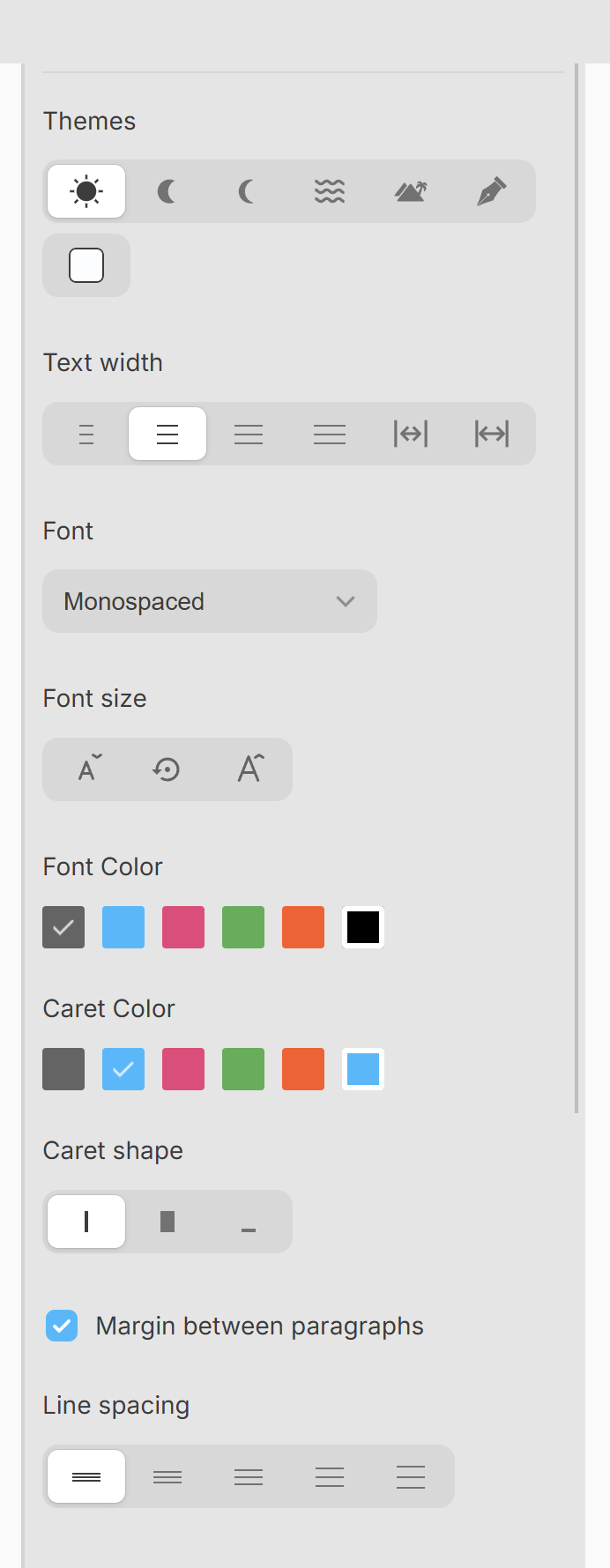
Font offers a serif, a monospaced typeface (the default) and a sans serif, chosen for long stretches of reading on a screen. On Windows, Mac and Linux the list goes on, below a divider, with every font installed on your system.
OpenDyslexic mode, in the Customization section, switches the text to OpenDyslexic, a typeface designed to be easier to read for people with dyslexia.
Size
Font size is a percentage, 100 by default, and goes from 40 to 600. Ctrl++⌘+ and Ctrl+-⌘- change it from the keyboard, and the middle button of the three puts it back to 100.
Width
Text width sets how wide the column of text is, from narrow (about 60 characters, the width of a book) through medium, wide and two extra-wide steps, to the full width of the window.
Spacing
Line spacing sets the distance between lines: single, 1.25, 1.5, 1.75 or double. Margin between paragraphs adds a blank space between paragraphs; turn it off for paragraphs that follow each other directly, as in a printed book.
All of this is about the screen. It does not change what the files contain, and only the font and size carry into the printed page and the PDF; see Export and print.
More in Focus and appearance
Dimming everything but the paragraph you are writing, hiding the cursor and the tabs, and taking the whole screen.
Six themes and a colour of your own, the colour of the text and of the cursor, and the shape of the cursor.
The counter at the bottom of the window, what it can show, and a target in words or characters for the document.
A sound for every key, in three flavours, with its own volume.